Dawn Felagund (![[personal profile]](https://www.dreamwidth.org/img/silk/identity/user.png) dawn_felagund) wrote2009-04-02 09:24 pm
dawn_felagund) wrote2009-04-02 09:24 pm
Entry tags:
Baby's First Illumination! (Sort Of ...)
Did you hear that loud whooshing wind last night around, oh, 9 p.m. EST? That was me sighing with relief as I finally, finally finished an illumination project that I think I've been working on forever. Well, that's an exaggeration, but it has been about a year. School interfered so that the only time I had to work was at Friday night SCA meetings, and if Master Tristan was there, it meant I spent the whole time running my mouth and not working. (Yes, I am totally putting the blame for my own indolence on him!) But, with school over, I jumped right back into it, determined to actually finish the darned thing ... and I did!
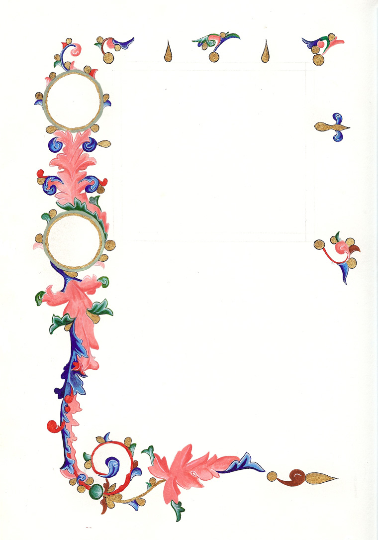
This is not my first illumination project. It's actually my fourth. But it's the first sorta-scroll-type thing. Yes, I am being wishy-washy because I'm still not sure that that's what it's going to be. It's also why it looks unfinished ... because it really is. If it is to be a scroll, then it will need calligraphy and the person's heraldry and such will be added. If I'm going to use it for myself, then I will probably fill in the border at the top and the other side and write a poem or something on it. But I don't know what I'm doing with it yet, so I've done the replication of the original until I decide or get some advice on it.
So, yes, this is my unfinished sorta-scroll-type thing or maybe-for-a-poem-type thing.
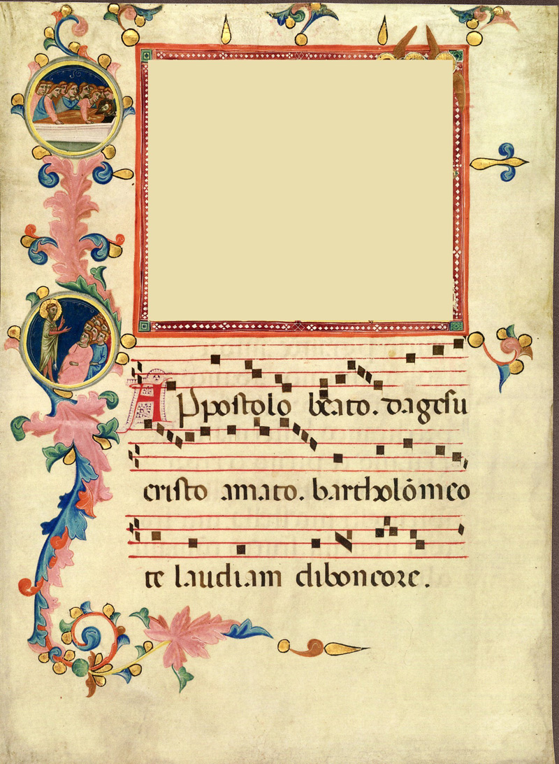
Here is the original. Click to view it full-sized.

Yes, there is a huge white rectangle in the middle of it and, no, that was not in the original. The story behind that is kind of funny. You see, Master Tristan picked this piece for me to work on. We were looking at it in the book one night and I wasn't really paying much mind to the miniature that belongs where the white rectangle is because I was looking at the acanthus in the border and the colors and the gilding, that is until Master Tristan said, "No, he's not putting on red socks and gloves."
Then I looked at the miniature and realized that it was a very graphic depiction of a man being flayed. Yes, that. You gotta love medieval illuminated manuscripts, where beautiful and lovingly crafted borders gently cradle scenes of gory and graphic torture.
I'm a blood/injury phobic. Most medieval art I can handle. I can handle the boiling and the burning ... even the drawing and quartering. But, for whatever reason, this particular painting really bothered me. I became light-headed and, throughout the rest of the night, I'd think on it occasionally and become faint again. I told Master Tristan that I would work on the piece, but I would not do the flaying scene and would Photoshop it out of the copy I was working from. And, being a kind teacher, when he sent me a scan of the illumination, it came sans flaying scene.
And I have left it that way (I don't even own an intact copy but I'm sure he'd send me one if I asked) because I don't want to subject Teh Flist to the icky flaying scene either. However, this miniature seems determined to weasel its way into my thoughts, no matter my efforts to avoid it. The Met museum recently did an exhibit of illuminated manuscripts and, while perusing a guide book, I happened on a page that looked really familiar, and when I looked closer ... flaying scene! Ack! The world got black and sparkly around the edges again.
So, now that you've heard the woes of an aspiring scribe who is also a blood/injury phobic, I give you my own work as it stands at this point. As before, click the image to view a full-sized version.

I do welcome comments, including critique, of my work, but this is not expected, of course.
As for self-critique, what I'd like to do better next time:
(Cross-posted to Hundrede Artes.)
This is not my first illumination project. It's actually my fourth. But it's the first sorta-scroll-type thing. Yes, I am being wishy-washy because I'm still not sure that that's what it's going to be. It's also why it looks unfinished ... because it really is. If it is to be a scroll, then it will need calligraphy and the person's heraldry and such will be added. If I'm going to use it for myself, then I will probably fill in the border at the top and the other side and write a poem or something on it. But I don't know what I'm doing with it yet, so I've done the replication of the original until I decide or get some advice on it.
So, yes, this is my unfinished sorta-scroll-type thing or maybe-for-a-poem-type thing.
Here is the original. Click to view it full-sized.
Yes, there is a huge white rectangle in the middle of it and, no, that was not in the original. The story behind that is kind of funny. You see, Master Tristan picked this piece for me to work on. We were looking at it in the book one night and I wasn't really paying much mind to the miniature that belongs where the white rectangle is because I was looking at the acanthus in the border and the colors and the gilding, that is until Master Tristan said, "No, he's not putting on red socks and gloves."
Then I looked at the miniature and realized that it was a very graphic depiction of a man being flayed. Yes, that. You gotta love medieval illuminated manuscripts, where beautiful and lovingly crafted borders gently cradle scenes of gory and graphic torture.
I'm a blood/injury phobic. Most medieval art I can handle. I can handle the boiling and the burning ... even the drawing and quartering. But, for whatever reason, this particular painting really bothered me. I became light-headed and, throughout the rest of the night, I'd think on it occasionally and become faint again. I told Master Tristan that I would work on the piece, but I would not do the flaying scene and would Photoshop it out of the copy I was working from. And, being a kind teacher, when he sent me a scan of the illumination, it came sans flaying scene.
And I have left it that way (I don't even own an intact copy but I'm sure he'd send me one if I asked) because I don't want to subject Teh Flist to the icky flaying scene either. However, this miniature seems determined to weasel its way into my thoughts, no matter my efforts to avoid it. The Met museum recently did an exhibit of illuminated manuscripts and, while perusing a guide book, I happened on a page that looked really familiar, and when I looked closer ... flaying scene! Ack! The world got black and sparkly around the edges again.
So, now that you've heard the woes of an aspiring scribe who is also a blood/injury phobic, I give you my own work as it stands at this point. As before, click the image to view a full-sized version.
I do welcome comments, including critique, of my work, but this is not expected, of course.
As for self-critique, what I'd like to do better next time:
- I need to be more aware of what is on my hands when I'm getting ready to paint. The margins of this piece look awful. I frequently dip or drag the heel of my hand into the paint on my pallet, and then I end up with drops on my work when my hand rests on the page. I erased the worst from the margins in Photoshop. (Luckily, they were confined to the margins.)
- I need to be more aware of how the lines and shadows are working to make the acanthus appear three-dimensional. I would do rote imitation of the colors and shading and, only when I was finished, realize that those elements worked to create a three-dimensional effect of a twisted leaf. There are a few places where it is terribly obvious that I am faking it. If I was more aware of this, my work would look more realistic, I think.
- My gilding is ragged and uneven, but I am much-improved now. I think this was the first piece I did after learning to gild so, all in all, not bad! :)
(Cross-posted to Hundrede Artes.)